Words by @mastervariant

Deep and bright royal blue skies, with a hint of crisp and clear frosty air, wandering in the A.M. around the concrete greys of NYC downtown past Bowery and Chinatown in the Spring of 1999. Ahead of the Nike x Stash Blue Pack Drops in 2024, I’m reminiscing here with then unknown foreshadowings to a visual artist who’s subway art, design and product have long been on my favourites list. On that particular day we were out to visit his store on Eldridge Street, and had no idea of how or when we were going to find it. But wandering around NYC on a perpetual quest, forever looking for records, sneaker mom & pops, army surplus hideouts for workwear hits and cheap rustic eats was a frequent NYC ritual. Our Google maps was a copy of Boon with a T-Shirt write up that shared the address, and that was enough to go looking for it. Downtown NYC locations of independent stores often had little to no bearing or shared correlation to its surroundings. Before any streetwear boom was yet to have happened, these locations were in un-attractive/residential locales that often quickly changed, and on subsequent visits had often moved or been shuttered up. NYC born & bred Subway artist Stash named his store Recon in such a locale. And we were out looking for it.
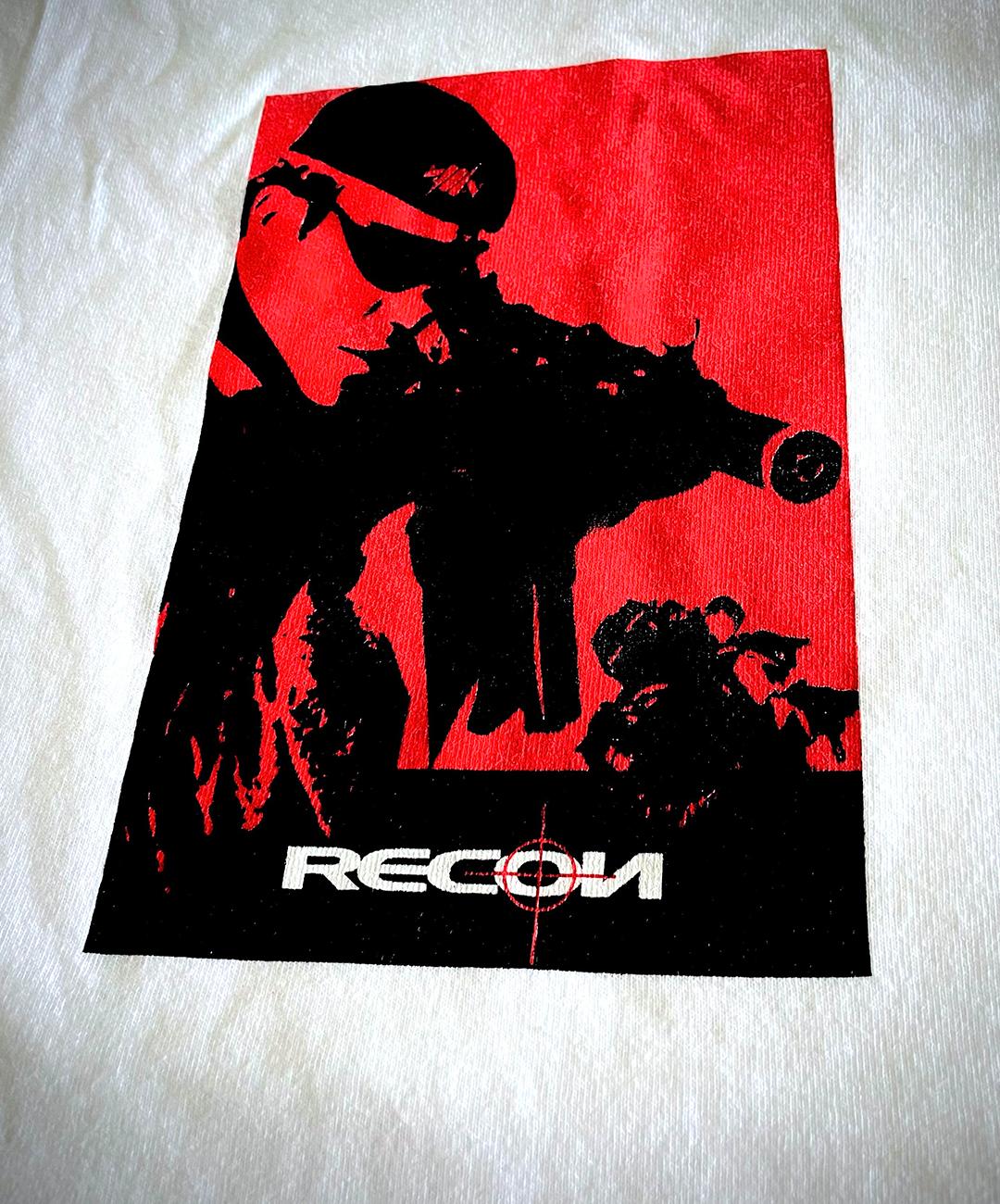

When we did, we actually walked past it and doubled back, such was the low key nature of its location. Half paying attention and just wandering around, soaking up the then relatively quiet neighbourhood, we dozed off course. The store windows were large with action figures on display and the east coast sun reflecting the high fenced dusty courtyards opposite. The space was sparse and on the shelving and white plinths were Action Man style helicopters and jeeps amongst custom painted MoWax Futura figures. Olive drab and walls painted in camouflage, standard battle dress. Welcome to Recon mission Ops. The Store space was neat yet un-formulaic with t-shirts and assorted brands/apparel… and that’s where the fun was then, not always knowing what was there, or what product was on shelves just waiting to be discovered. Military inspired, barbwire logos, map grid lines, weaponry motifs, sniper illustrations, all fused amidst razor sharp visual designs while computer and gaming graphics were still finding its feet.
Winding back, there was just something massively appealing to me about Stash and his related NY subway art collective’s output. Stash’s Recon / Subware brands appeared around 1993 from the origins of his earlier projects, Phillies Blunt, GSF / BSF and Project Dragon and his projects just seemed to hit all the right notes at the right time. The early works of the aforementioned were experimental, super clean and the graphics were always on point. They included many friends who took apart and contributed, most notably Kaws when he was still dismantling bus stop displays. Subware/Recon continued with this blend of sharp angles emerging from spray can blurs and typography styles producing a lean into harder edged graphics, his ever evolving spray can /fatcap motif and iconography was always integrated throughout, incorporating architecture, engineering, warfare and film and gaming graphics. Its inspiration was wide and crossed boundaries, and everything, well, just seemed to fit.


By the time Subware was in full output mode, a whole new genre of product aficionado had been growing steadily. Hearing and seeing the visual impact of Stash’s childhood friend and brand collaborator Futura 2000 on James Lavelle’s Mowax label, added the soundtrack, this combination was all just so different and new. The ever present subway art visuals with unmistakable detailing, the military influence, and the urgency of utility informed by how NYC was unknowingly shaping street culture, all imbued by the transition and evolution of the subway art style as it left the train yards and skateparks. The wider culture influences were so key in its summation and eventual transfer onto product that it went way beyond to echo globally. It was just so good, where pre-street style was concerned that wasn’t based around music movements, everything else seemed conformist, so much was happening around subway art crossing mediums and eventually into mainstream art galleries. It both found and created a new niche. The extended subway art movement had loyal family and communities growing in NY, SF, London, Hong Kong, Tokyo and beyond, all doing similar while also frequently collaborating with intense creative synergy.

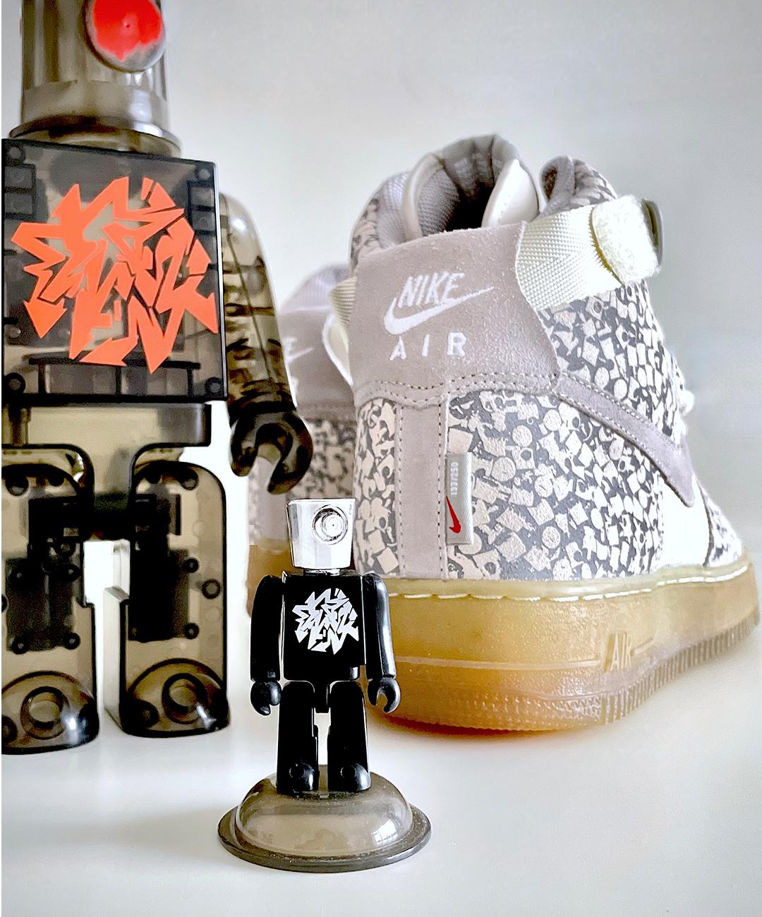
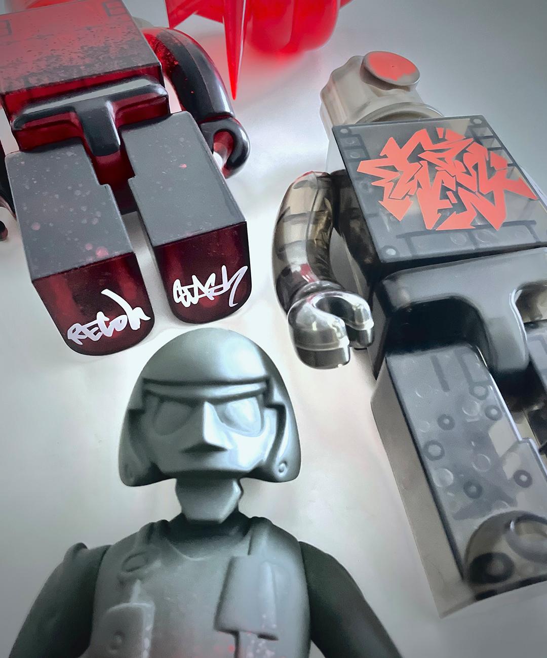
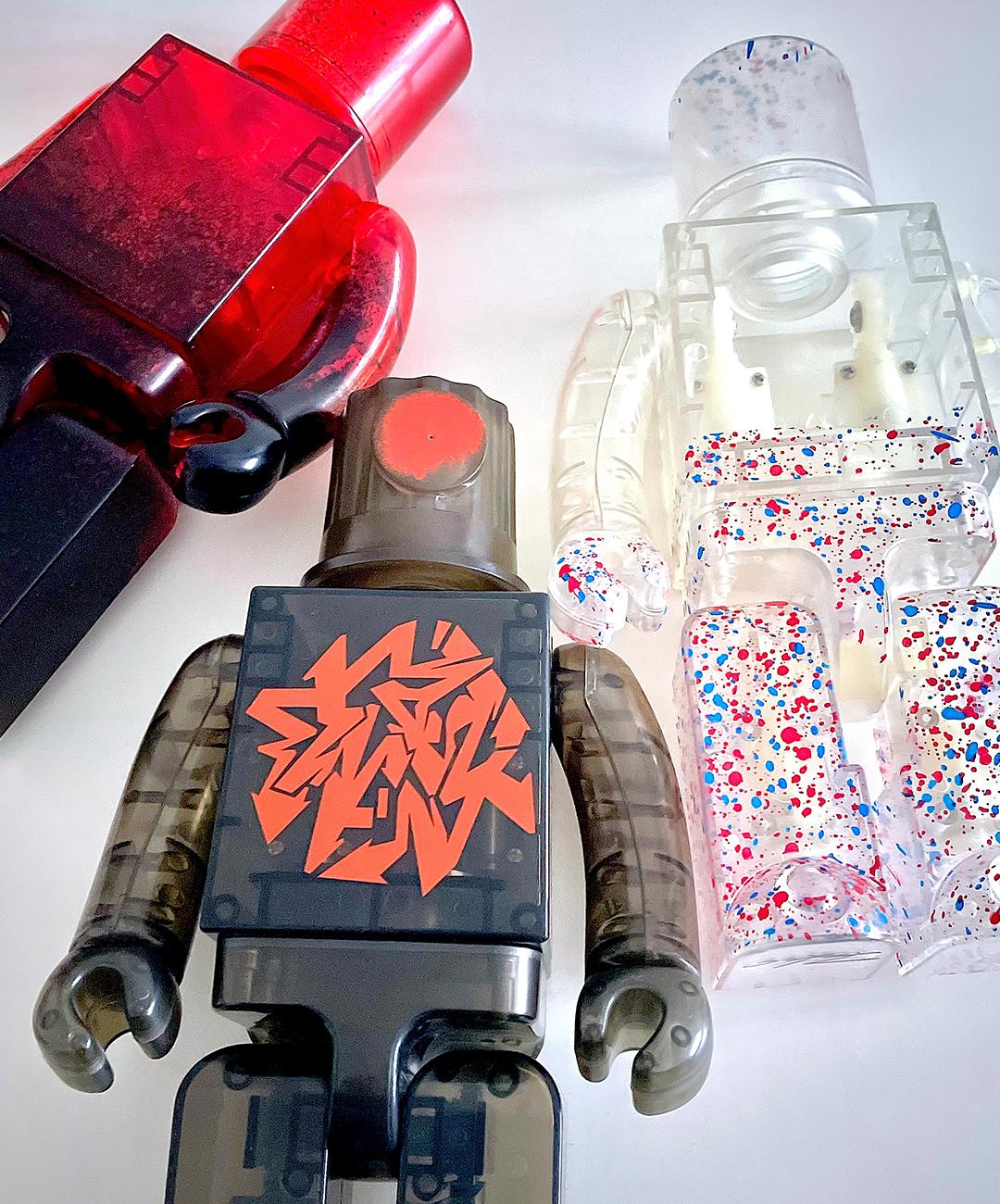
Nobody was really doing anything like this at this time. The energy was hugely infectious. With Stash’s output, all you had to do was read the covert messaging on his Subware and Recon labels. Skate culture aesthetics were moving away from tired and novelty cartoon like graphics, becoming more sophisticated, more functional but still defiantly subversive. Casual sportswear was evolving, the intent was changing, but it felt, more importantly, still anti-mainstream and alternative. Skate-wear for non-skaters, and functional fits for non-casuals. There was a reason for it existing. Upping the game and provoking thought. There was a purpose. Frequent collaborations with Japan’s Medicom Toys produced a long line of Bearbricks, Kubricks and a series of Stash action figures.

And of course then came the shoes …
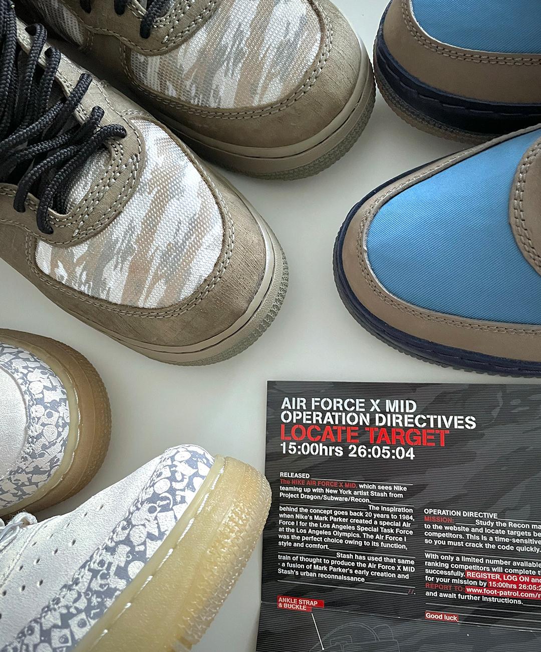
Stash’s first signature work for Nike came in 2003 and celebrated NYC’s very own, the Air Force One. Nike had not given a non-athlete/ artist their own shoe at this point, and it was specifically packaged for NYC, Tokyo and London only. For the high top beige suede, Stash applied his spray can nozzle motif, a design he says came from the idea where he wanted to represent the spray art movement but move away from cartoon like characters and reliance on lettering and typography. Adding a translucent midsole and region coloured flight case with foam inserts, the spray drip city logo exterior finished the set off. The subway art movement was being recognised, becoming a product, itself in turn becoming art. Two further event exclusive, commemorative iterations followed which he was less involved until his next collaboration, the 2004 Military themed AFX Mids, which included updated ballistic uppers with camo mesh and reinforced toe caps.
Not long later in 2006, his signature bright toned blues and muted greys appeared again on his ‘Blue Pack’ drop consisting of an Air Force 1 and Air Max 95. Colours, he says pay tribute to his time riding the NYC silver/grey subway trains amidst the blue sky backdrops. Originally appearing on 2003’s limited release for charity Air Max BW, it wasn’t until now did the public finally get their chance to own this colorway on 2 other classic silhouettes, which were selected as they were his personal favourites.
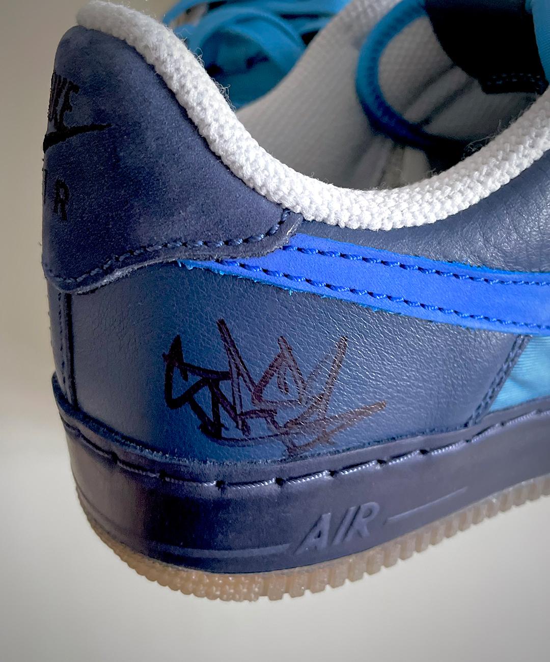

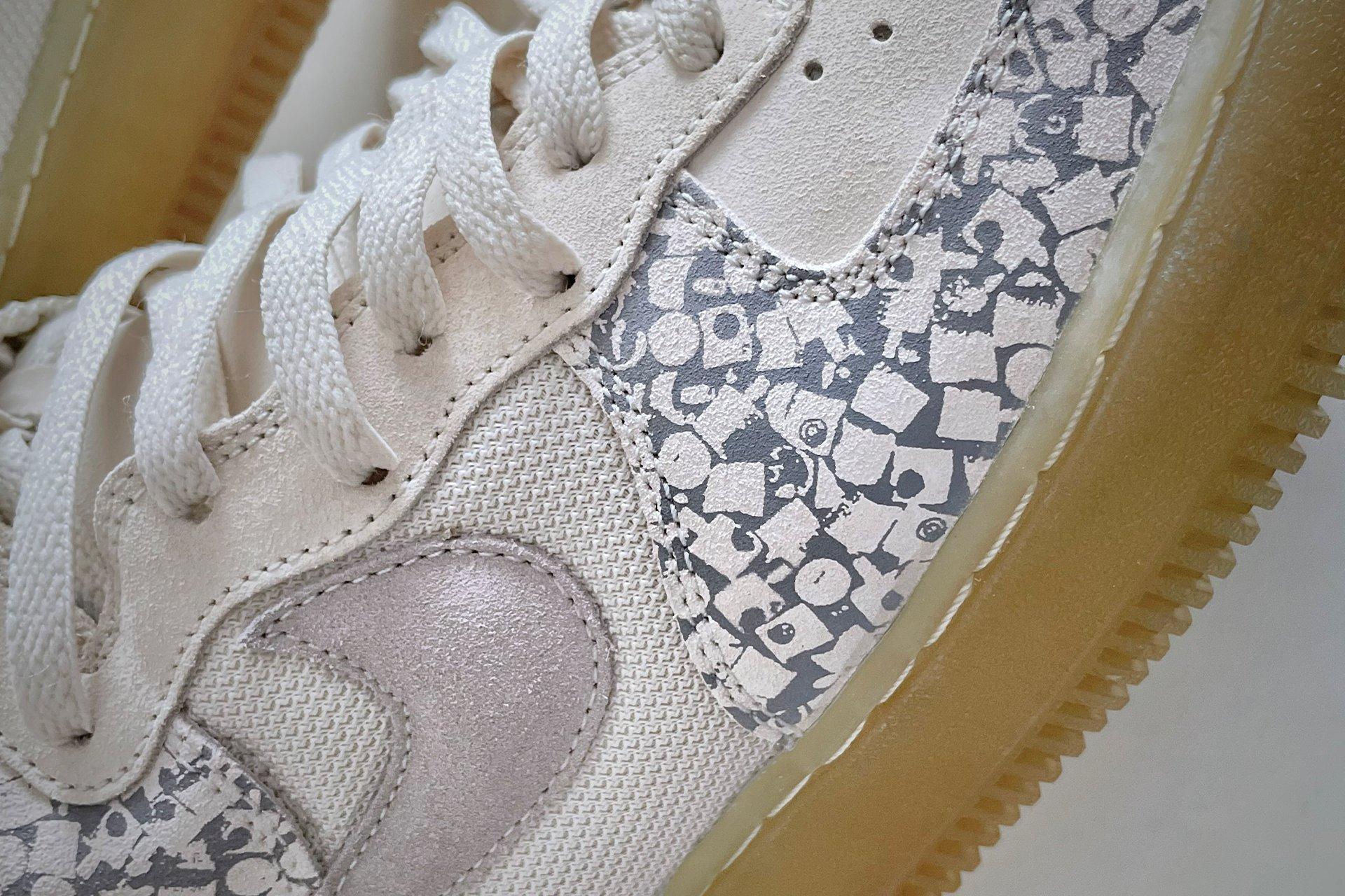
The 2024 editions sees updates to both the Air Max 95 and Air force 1, continuing what he started in 2006 and for reasons of budget and design restrictions, elements he wasn’t able to fully explore then, he has taken further on the 2024 models. The use of Nike Dri-fit uppers continues to give the both shoes added weather protection while additional fused panelling, ripstop nylon and more robust rolled leather shows on the Air Force 1. The extended lace loops and metal eyelets on the Air Max 95 now with added hidden Stash pouch and switchable embroidered tongue tags, adds a special personal touch. Both models have much more rugged reinforcement, inspired from Stash’s love of Nike ACG concepts and hard wearing, urban functionality. Both are very nicely done, taking nothing away from the originals but adding further features very much in step for 2024.
The Blue Pack x Stash. Welcome back .